ART & CREATIVE DIRECTION
A collaborative effort with: Reza Harek


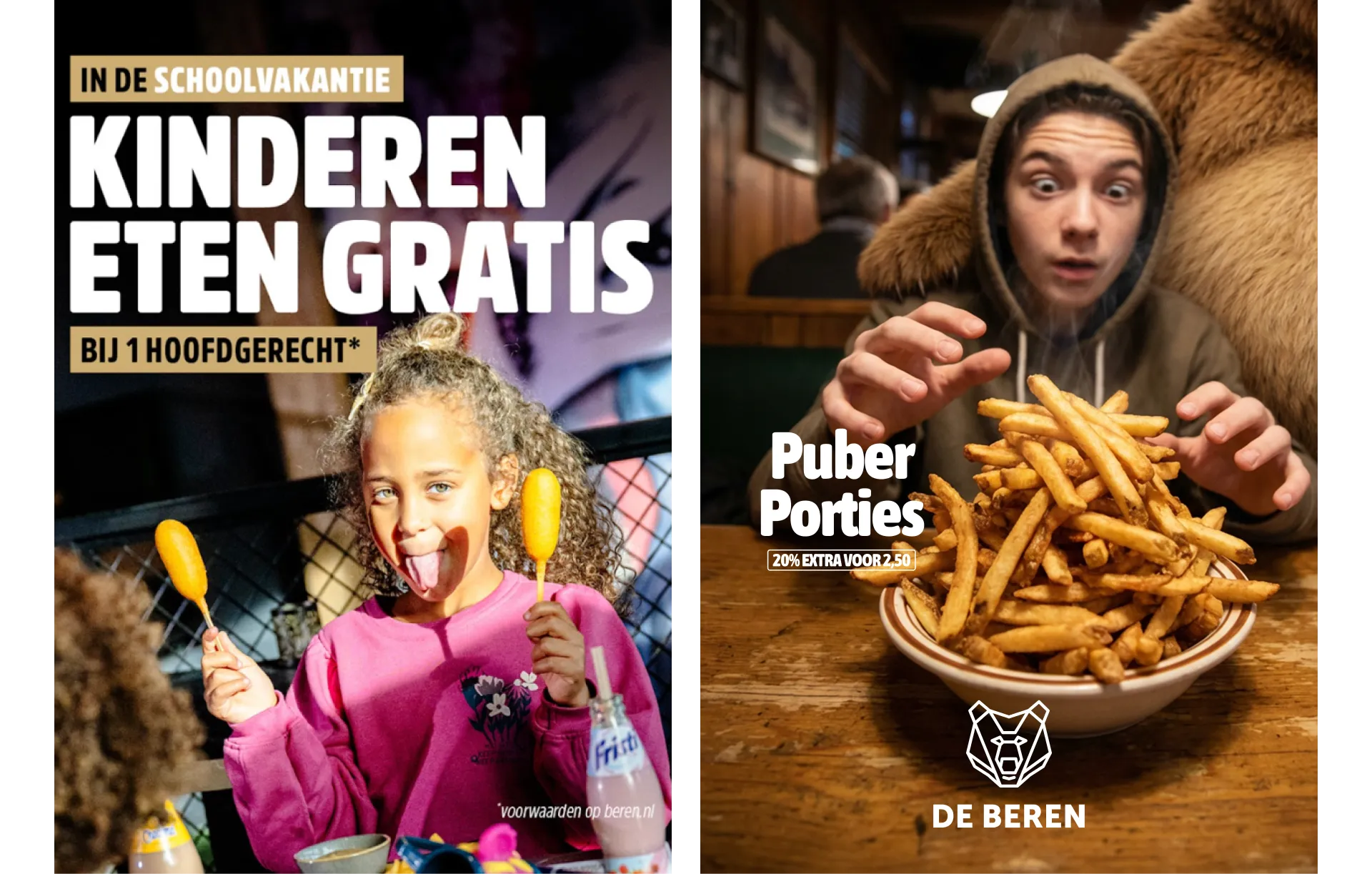

From discounts to distinction
ART & CREATIVE DIRECTION
A collaborative effort with: Reza Harek
For De Beren, we rebuilt and sharpened the visual identity to support a strategic repositioning: shifting the brand from action-heavy, promotion-driven communication to a more confident, quality-focused restaurant experience.
At the core of the renewed system sits one clear principle: “Lekker + Leuk.”
Everything we create must deliver both — in word and in image.
We introduced a clear communication grid and embraced a less = more philosophy. By reducing visual noise and limiting elements per execution, the message becomes stronger, faster and more recognisable.
The bear evolved from a static logo into a flexible brand asset — expressive, character-driven and central to the communication system — without becoming gimmicky.
The result is a cohesive and scalable identity that aligns brand perception with business ambition, bringing clarity, consistency and confidence to every touchpoint.